Sunday, 3 May 2015

Quentin shoot

The quentin shoot was a disaster! first I used the wrong kind of face paint then I tried to blend powder into facepaint (school boy error) Then the latex mouth piece wasn't going right!
 When i was done with my little tantrum i took a breather then started to think logically. I used oil based face paint so if course i had to use supracolor for colouring. With the mouth piece i used latex to blend the edges out as much as possible then pray it worked out!

This my final image


The shoot went much better than expected and when i changed the contrast and brightness i finally liked my image!


Claudia Shoot


These are some of my favourite pictures from the shoot.
I think the shoot went really well. Whiles doing the make up i did change some products. Instead of using powder based products i used supracolor instead as it blends in more with the face and looks more realistic on camera. Instead of using greys i used browns to make her face look really tired and i backcombed her hair to look like she doesn't take care of herself.
~Overall i am happy with the look as it is subtle yet effective.


Quentin final charts

I Decided to go with this face chart for my final quentin look                                                                              

I wanted to completely blank out quentins mouth due to claudia wanting to keep quiet!
I searched through youtube and came across this video


I took to the idea of creating a piece from latex and toilet roll to make a smooth  mouth piece to then blank out the mouth.

Friday, 24 April 2015

Facecharts:Quentin


  • kryolan eyeshadow pallette
  • latex
  • white facepaint
  • mac coppering


  • mac coppering
  • mac embark
  • mac carbon


mac carbon
mac coppering


supra color pallette 

Final Costumes

Mustard cardigan soaked in tea bags.
Charity shop dress.


Quentin - Vest top , short sleeve blue shirt old my old


Lana Winters American Horror Story

Thursday, 23 April 2015

Quentin hair ////

In the 60's it was a drastic change to mens hair, from sauve sleek styles to over grown mops !
seeing as quentin is a figure of Claudia's imagination he could have either.
These styles have caught my eye.


http://youngblog.com/wp-content/uploads/2014/08/1950s-mens-hairstyles-costume-ideas-amp-suggestions-1960s-mad-men-theme-party-shot-in.jpg


https://s-media-cache-ak0.pinimg.com/736x/6f/f0/2d/6ff02d986db350572a85fa800ce0f104.jpg

presentation

American Horror story- Asylum
I chose this tv series/season because i fits in with my original idea before the brief change.


The setting is Briarcliff Mental institute, massachusetts


So Who Watches it?

18-49 years olds watch this show due to the gripping storyline. The sexual side of things cater to both age groups as the idea of sexy in this program is old and young. what also makes this program interesting is the fact that they keep the same actors every series but give them different characters to play.
Claudia
My version of claudia fits into this series because she is a mental patient.
Claudia is a young Girl Trapped in a Asylum due to her personality disorder. Claudia has created an alter-ego/personality Quentin. She becomes Quentin when she feels angry , upset or vulnerable. Quentin often appears with an alien like face. This is because Claudia feels like an alien and like nobody understands her. He also sometimes appears with a mutilated mouth. This is because Claudia wishes he would shut up half the time as his thoughts are usually harmful or depressing. The audience will often see Claudia and 'Quentin' have arguments in the cell (Whiles Claudia looks into a mirror). Sometimes it would seem like a marital squabble or something a lot more scary and abusive. Claudia will appear on a 'Good day' (whatever that is in an asylum), Quentin appears on bad days (depressed, self harming , suicidal Claudia) Though you occasionally see them together when one personality attempts to break through.

I chose the word slipping because claudia is slowly slipping from reality, She's starting to wonder if Quentin is real or whether its a dark side she never knew she had.
The key word inspired me to investigate mental disorders, i started to look at personality disorders and watch videos of real people experiencing a personality disorder.

I now need to practise the different ways of someone looking crazy, tired , warn out and maybe ill.


My claudia Facechart


Quentin 

How does he fit into the series? He is Claudias 'other' personality 
what will i need to do to develop my character? Research personality disorders and look at sfx for the mouth.


Quentin face chart! 


I now need to practise the special effects side and find costumes 


Wednesday, 22 April 2015

Facecharts:claudia

RED LIPSTICK AROUND MOUTH MARY EUNICE GAVE TO HER. TRYS TO TAKE CARE OF HER APPEARANCE BUT SHES JUST MENTAL

My first face chart demonstrates a light tired look. I imagine this is what someone would look like with sleepless nights due to the loud sounds of the asylum and also the stress of her personality disorder.


This look is the same tired look but with an added red lipstick that belonged to Sister mary eunice. This facechart is showing that Claudia may still try to take care of herself in prison


This is claudia in a scene that i imagined her in.
Quentin convinces her to kill one of the nuns and afterwards she completely snaps, She stares into the mirror laughing creeply and applying lipstick over and over untill it starts to pass the lines of her lips and on to her face.


With this look i used alot of yellow in the face to show the begging of jaundice. 


This is another tired haggard look but very dark and ill looking. i used lots of browns pinks and dark purples with this look.


Saturday, 18 April 2015

Claudia hair.

The 60's is famous for the classic beehive, the fringe and ponytails!
considering that Claudia lives in a asylum I only assume that she will not have access to the latest  beauty products so in reality she looks like a mess.

my model has short blonde hair with a full fringe. I can work the fringe to an advantage as it was very popular in the 60's.

I decided to google for some images of 'crazy' people to see what sort of hair they may have. I also researched the characters from the series to see how well(or unwell ) kept their hair was.


Watching the video above everyone seems to have incredible bedhead hair when kept inside the asylum.


http://www.vanityfair.com/unchanged/2013/01/american-horror-story-recap-gore-dries-up-aliens-go-awol

This image from vanity fair shows sister Jude Martin (jessica Lange) when she was declared crazy and was sectioned. As you can see by looking at her hair its messy with a natural curl.
I think i could achieve this sort of natural mess by letting my model go to bed with bed hair in a towel.


Another Thought I had I that if Claudia was fairly new to the asylum she would still have the hair and make up that she had the days she was sectioned.  I later realized that all patients at briar cliff go through a cleansing stage where they are stripped naked and washed clean! so maybe not!


Sunday, 12 April 2015

Costume research

Whiles watching AHS i realized that the patients wear any type of clothing but it is a dull blue with some sort of  jacket/cardigan


http://vignette2.wikia.nocookie.net/americanhorrorstory/images/6/6a/Pepper1280.jpg/revision/latest?cb=20121105110305

Pepper wears dull blue and a powder pink cardi


https://www.google.co.uk/search?q=american+horror+story+asylum&espv=2&biw=1242&bih=545&site=webhp&tbm=isch&source=lnms&sa=X&ei=w_IqVY__INarafm9gNgL&ved=0CAYQ_AUoAQ#tbm=isch&q=american+horror+story+asylum+kit&revid=47607094&imgrc=CuTxDORU3XrDxM%253A%3BhNGbXqu3OliPYM%3Bhttp%253A%252F%252Fmedia.giphy.com%252Fmedia%252Fjy4wQA6Iij81q%252Fgiphy.gif%3Bhttp%253A%252F%252Fgiphy.com%252Fgifs%252Fcute-dancing-dance-jy4wQA6Iij81q%3B245%3B245

 kit wears a dull blue shirt dark bottoms and a white t-shirt. this outfit screams 50's as this was the style young men wore. Perhaps more lively colours though.


Steve Boyd photographed by Pat Supsiri
 1950s mens style.
https://www.pinterest.com/damienbasile/damien-basile-fw15-inspiration/

you can see that all though kit is in a asylum he still tries to keep his 'uniform' current


http://www.allthatsepic.com/television/american-horror-story-asylum-episode-4-review/


this picture shows all of the patients wearing a dull blue or navy colour

UPDATE:18.04.15

I've decided to put Claudia in a night dress with a tattered mustard cardi! hopefully i will be able to find both whiles charity shopping!

Thinking ahead : possible location for shoot?


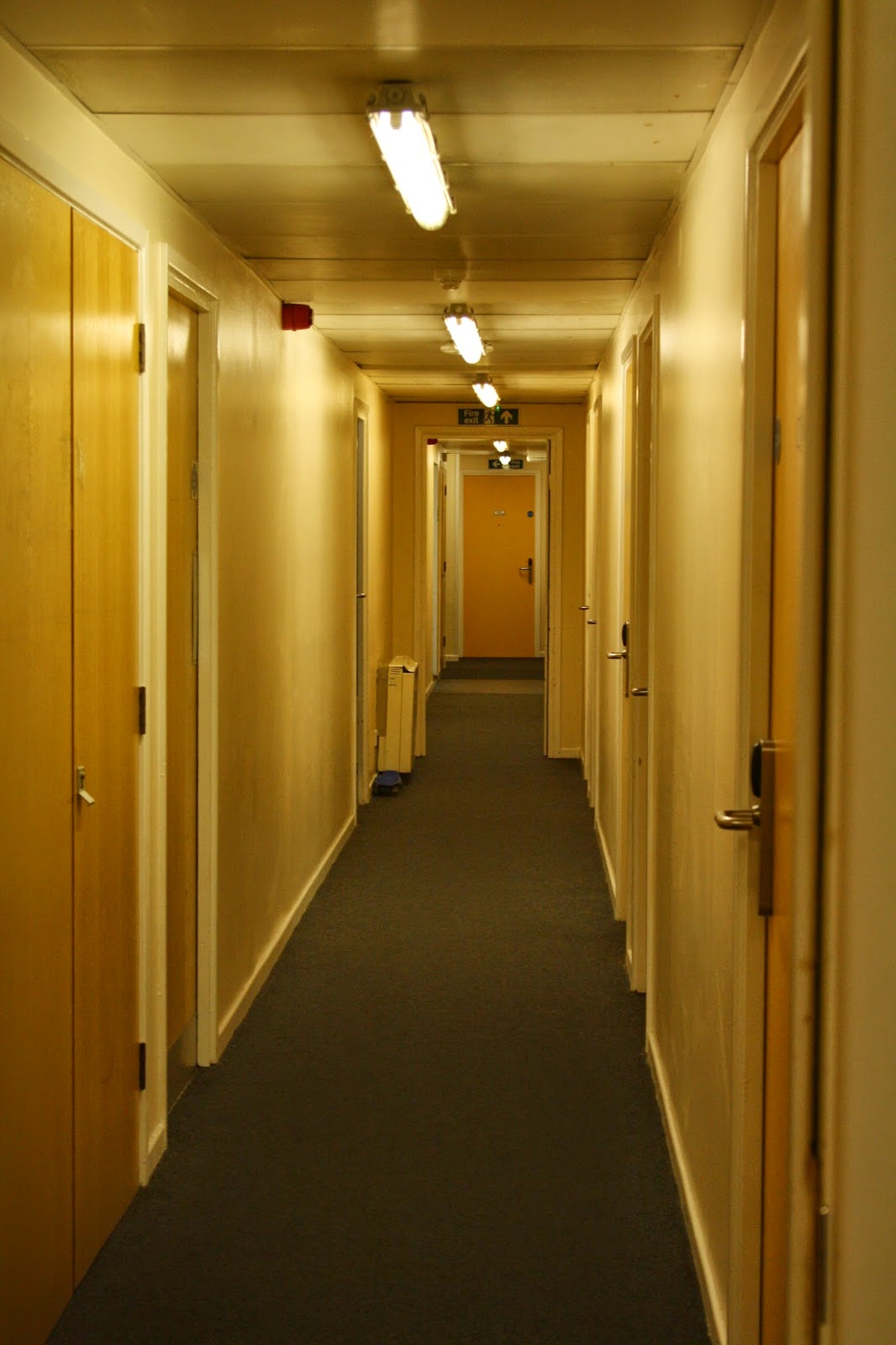
This was one of my possible locations for my shoot. 
This is my student halls and ever since i moved in i thought it looked like come sort of prison or asylum!

Tuesday, 7 April 2015

Notes: Claudia

when i think about Claudia i think of her being a pretty blonde thing, Innocent as ever but her personality disorder has landed her in the asylum. I Feel that she will need to fit in with her surroundings so i need to watch the episode carefully and focus on the patients clothing, hygiene and hair. This will show whether the nuns take good care of the patients or whether they are left to fend for themselves.


In this video you can see the patient looks reasonably clean but very tired looking and rough.


When looking at Lana Winter (A reporter wrongfully put into the asylum) You can see that she is clean but looks pale, unwell and unkept. I also noticed that a lot of the patients wear a pale blue colour which i will need to take into consideration when creating my Claudia character 


The hair of the patients is often looks like they have been in bed for days and have never seen a comb! 


Things I need to look at due to this research:

  • Costume for Claudia to match other patients 
  • Costume for Quentin, Will he dress like the other patients or will he wear whatever claudia wants him to due to being a delusion! 
  • ways to mess up hair and make it look unkept
  • ways to make claudia look tired, unkept and ill

American what?

American horror story, an original anthology series created by Ryan Murphy. This series features self-contained story lines in plenty of haunted locations. The Series I am Focusing on is Asylum.
In Briarcliff Mental Institute, Massachusetts the story's follows a number of mental patients and their own individual story's, most being bizarre or supernatural.

From Possessed nuns to Alien invasions I am 100% sure I can fit my characters in with ease!


Thursday, 2 April 2015

Story line and ideas.

My idea for this project.

The Mr and Mrs comfort pictures gave me an idea of a twisted beauty and beast.


Claudia is a young Girl Trapped in a Asylum due to her personality disorder. Claudia has created an alter-ego/personality Quentin. She becomes Quentin when she feels angry , upset or vulnerable. Quentin often appears with an alien like face. This is because Claudia feels like an alien and like nobody understands her. He also sometimes appears with a mutilated mouth. This is because Claudia wishes he would shut up half the time as his thoughts are usually harmful or depressing. The audience will often see Claudia and 'Quentin' have arguments in the cell (Whiles Claudia looks into a mirror). Sometimes it would seem like a marital squabble or something a lot more scary and abusive. Claudia will appear on a 'Good day' (whatever that is in an asylum), Quentin appears on bad days (depressed, self harming , suicidal Claudia) Though you occasionally see them together when one personality attempts to break through.


The Scene you first meet Claudia and Quentin.

*The Camera explores the asylum looking into each cell at each patient. The audience will see patients either child like and playful, Crazy and possessed or rocking in the corner.
The camera pauses at Claudia's room. You see a young, dirty haggard girl looking into the mirror. You see her lips move but hear no sound. As the camera comes closer you can hear Claudia arguing with her reflection.

Claudia: ' Leave me alone they told me you are not real!'

You hear a voice reply but you can't see the reflection at this angle.

Strange Deep Voice: 'Just imagine, everyone of these fools hanging from the ceiling up there. So beautiful'

The camera is still slowly zooming in then you catch a glimpse of something. An alien like face stares back at Claudia

What do i need to do next?
I  need to watch ahs asylum again and focus more on costumes and i will need to look at videos of real patients with personality disorder to research there mannerisms and traits.


Tuesday, 24 March 2015

First Research- Claudia and Quentin.

When I first read the brief i wanted to go all out. I wanted to use my imagination at best as I think I've played it pretty safe recently. I started by searching youtube for prosthetic tutorials just to get some general ideas.
I wanted to create a fantasy character

These are some of the videos i came across


next I looked at some images 


I liked the idea of the skull on the face but if i was to do this it would be less glamourous 


I really like this image and may take some attributes for my design  

I like the idea of sewn up lips for Quentin as he is controlled by Claudia 


Another image i may take attributes from 


Mr and Mrs Comfort

Source: The new yorker.


 Richard Avedon
Mr and Mrs comfort.
For the New Yorker 
1995

We were shown these images in contextual studies and i could not help but think of these two as Claudia and Quentin. I love the colour scheme of these pictures and some of the bizarre poses! 
I cant help but wonder of the story behind these pictures. 

Here are some of my favourite images! 


i imagine
Quentin bowing down to his 'owner'


I imagine the image above to be Claudia yearning to get out of her apartment but her fear is defeating her! 


When I see this picture I imagine Claudia is claiming her possession. 


Monday, 23 March 2015

Julien Macdonald 'Grunge deluxe' Recreation

In our first make up lesson for the second half of our project we was asked to choose an image out of those provided and recreate the exact look. I had no trouble choosing the grunge deluxe by julien macdonald as the 90s grunge era is my absolute fave!


Some info on this look 


  • inspired by Marilyn Manson 
  • This look was about creating a flawless base , contour and highlight
  • eyes black/grey , shadow was blended from the lash line to the brows for a boyish look
  • The disheveled hair suggested a night of partying casually pulled back into a french twist ponytail, leaving shards of hair hanging across the face. 


This is my version of the look.

Make-up 
To achieve this look I started by creating a flawless base, applying the models Mac foundation making sure I blended well. 
I used the sleek eyebrow palette to fill in her brows then messing them up slightly with a mascara wand.
To do the eyes i used my sleek au natural eye-shadow in black and applied like I would liner, I then took a cotton bud and some Vaseline and began bringing the eye-shadow up creating the shiny blended look seen in the photos.  

Hair 

To create the hair i simply seperated the fringe from the back section and took the back section into a french twist, I then wetted my hand slightly and began scrunch the models fringe to create movement. 


Sunday, 22 March 2015

Great expectations project evaluation

In the first half of this project we were asked to create a look for Miss Havisham which we would be able to create again. When I first started my research I began to realize that the Victorians wore little make-up and I began to worry that I wouldn't be able to make my look stand out. As I furthered my research I had ideas come to me easily? What I was worried about the most was recreating the look the exact same, especially the hair. I realized that the Victorians had so many different hairstyles so I had a lot of variety. I started with hair first and had to take into consideration that my partner who I would be doing my look on had a short full fringe, I realized there wasn't much I could do with her fringe so I went with a curly fringe that was popular in the mid-18th century. When It came to make-up I wanted her to look old and haggard so I went with a pale base, red sore eyes and a grey contour. When it came to the first half of the assessment I wasn't that nervous and felt like I did quite well, I even finished quite early! The second half of the assessment is what worried me as I needed to make the look exactly the same. In the end it went quite well and I could only see slight differences. Overall the project went very well all though I was quite worried at the start. 

Monday, 16 March 2015

Estella design


Design one 
This is Estella when she was beaten by her husband. I created the whole look using the Kryolan Eyeshadow palette provided in our kits.


Design Two 

This is how i imagined her in the spring, Light contouring , spring yellow eyes and pink blush, 


Design three 

This is Estella on her wedding day.
The Victorians did not use a lot of make-up so i kept the look minimal
with light contouring, blush and one colour of eyeshadow. 

Saturday, 14 March 2015

Estella assessment


This is my final design and assessment  for Estella.
I decided to go for a bridal look as its something different to what i'd usually do.
minimal make up was used during victorian times so i found it hard to make the look bridal.
I used minimal foundation , light contouring on the cheekbones and no product on the lashes and brows. I also patted some lipstick on thd lips to create a light colour. With the hair the only thing im only unhappy about it the fringe didnt to plan, it did not ccreate a nice curve shape like in my practises.